All examples shown on this page are integrated as built-in
demos into
the Android
App. They can be launched without using a real arduino or
ftDuino.
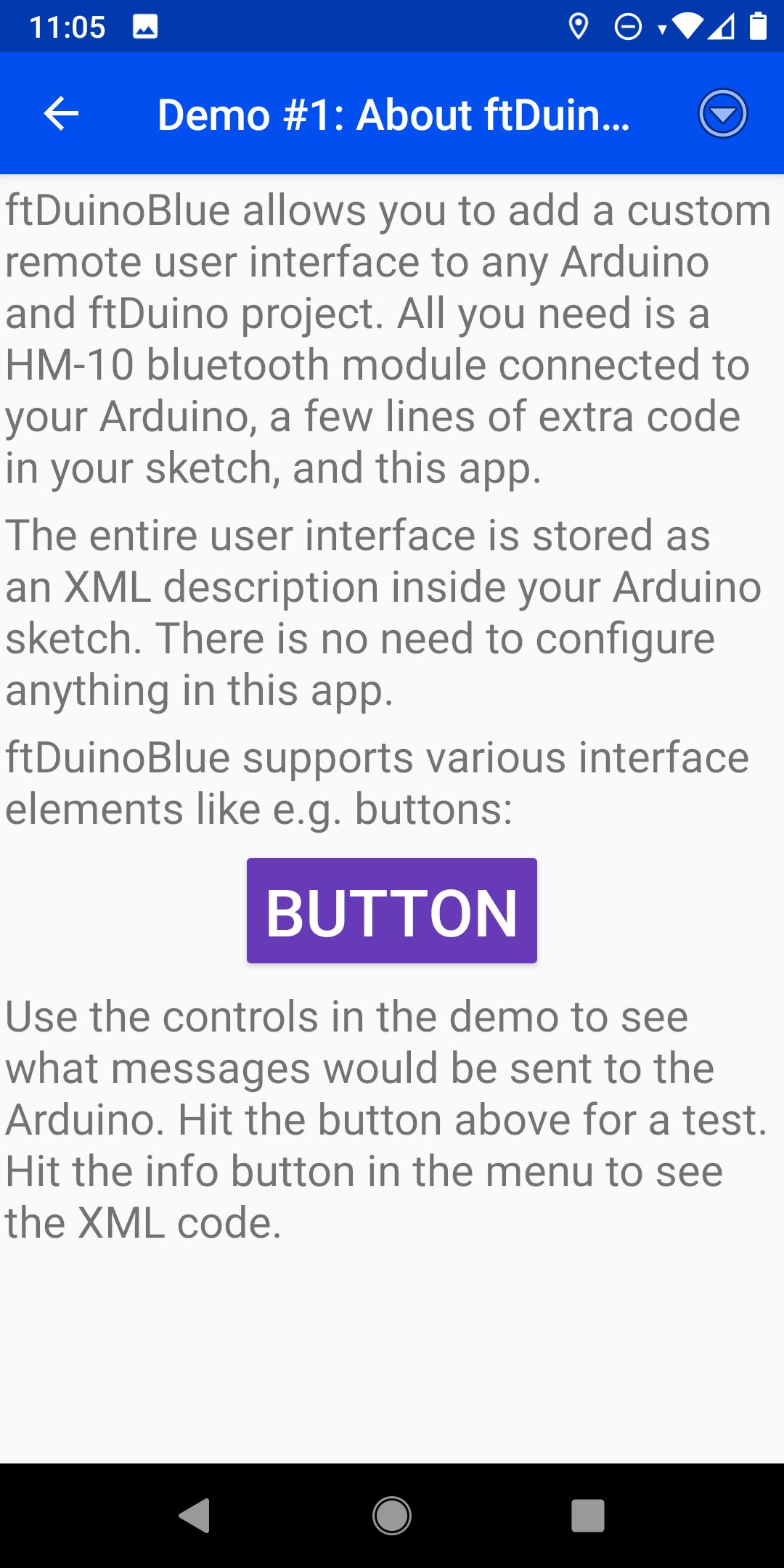
Demo #1: About ftDuinoBlue
This demo is supposed to explain the basic concepts by itself. but it equally well uses the
basic mechanisms itself.
The whole XML description of the user interface consists of the
one big layout element. This includes the different
user interface elements. In this case these are mainly text
elements (labels) representing the explanations given to the
user. But it also includes a button as an interactive
element.
All elements have to be given an id. The id can be freely
choosen. E.g. the button in this example uses id 4. This id
serves two main purposes:
The id is used to reference it in the layout to place other
elements above, below, left of this element. E.g. the label
with id 5 is placed below the button with the id 4 as its
placement includes place='hcenter;below:4'.
The id is used when notfying the arduino of user interaction. E.g.
if the user pressed the button with the id 4 down the app will send
BUTTON 4 DOWN to the arduino to tell it that the
button with the id 4 has been pressed down by the user.
The various values for the place attribute allow for complex relative
layouts as also shown in the other demos.
List of all placement values
Values for the place attribute
The possible values to be used inside a place attribute are
listed below. Most values only affect only the horizontal or
only the vertical placement. Two values can therefore be
combined in a place attribute using a semicolon
like e.g. place='top;hcenter'.
center
Center the element
vertically and horizontally on the screen
hcenter
Center the element
horizontally on the screen
vcenter
Center the element
vertically on the screen
top
Place at the top of the
screen
bottom
Place at the bottom of
the screen
start
Place at the start of the
screen
end
Place at the end of the
screen
left
Place at the left screen
border
right
place at the right screen
border
above:X
Place above the element
with id X
below:X
Place below the element
with id X
left_of:X
Place left of the
element with id X
right_of:X
Place right of the
element with id X
start_of:X
Place at start of the
element with id X
end_of:X
Place at end of the
element with id X
align_top:X
Align this elements
top with the top of the element with id X
align_bottom:X
Align this
elements bottom with the bottom of the element with id
X
align_start:X
Align this
elements start with the start of the element with id X
align_end:X
Align this elements
end with the end of the element with id X
align_left:X
Align this elements
left side with the left side of the element with id X
align_right:X
Align this
elements right side with the right side of the element with
id X
align_baseline:X
Align this
elements text baseline with the text baseline of the element
with id X. This makes both texts appear as sitting on the
same line.
Various other attributes allow to style the elements by
e.g. changing their size oder color.
<layout orientation='portrait' name='Demo #1: About ftDuinoBlue'>
<label id='1' size='20' place='left;top'>ftDuinoBlue allows you to add a custom remote user interface to any Arduino and ftDuino project. All you need is a HM-10 bluetooth module connected to your Arduino, a few lines of extra code in your sketch, and this app.</label>
<label id='2' size='20' place='left;below:1'>The entire user interface is stored as an XML description inside your Arduino sketch. There is no need to configure anything in this app.</label>
<label id='3' size='20' place='left;below:2'>ftDuinoBlue supports various interface elements like e.g. buttons:</label>
<button id='4' size='30' color='white' bgcolor='#673AB7' place='hcenter;below:3'>Button</button>
<label id='5' size='20' place='left;below:4'>Use the controls in the demo to see what messages would be sent to the Arduino. Hit the button above for a test. Hit the info button in the menu to see the XML code.</label>
</layout>
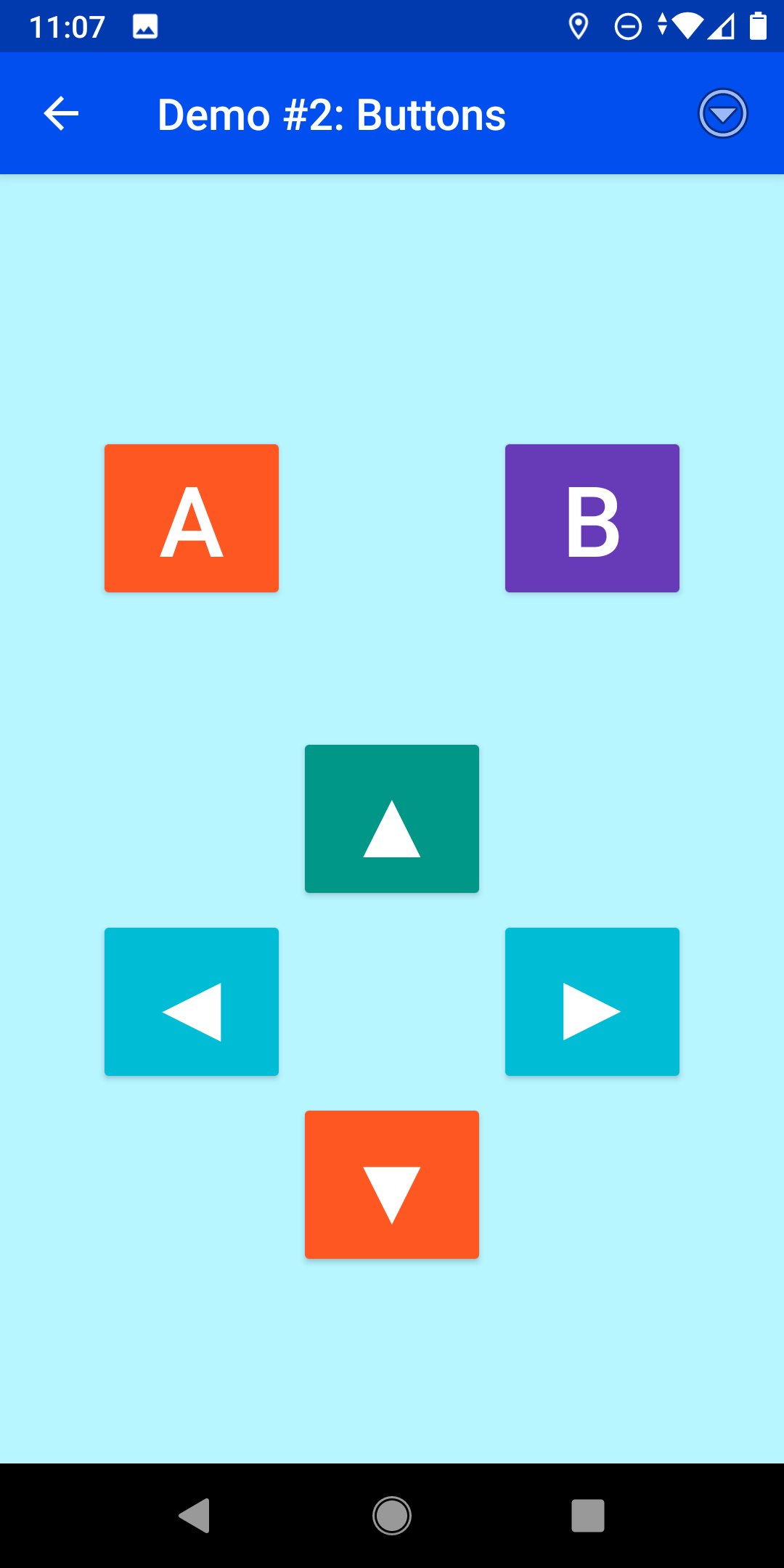
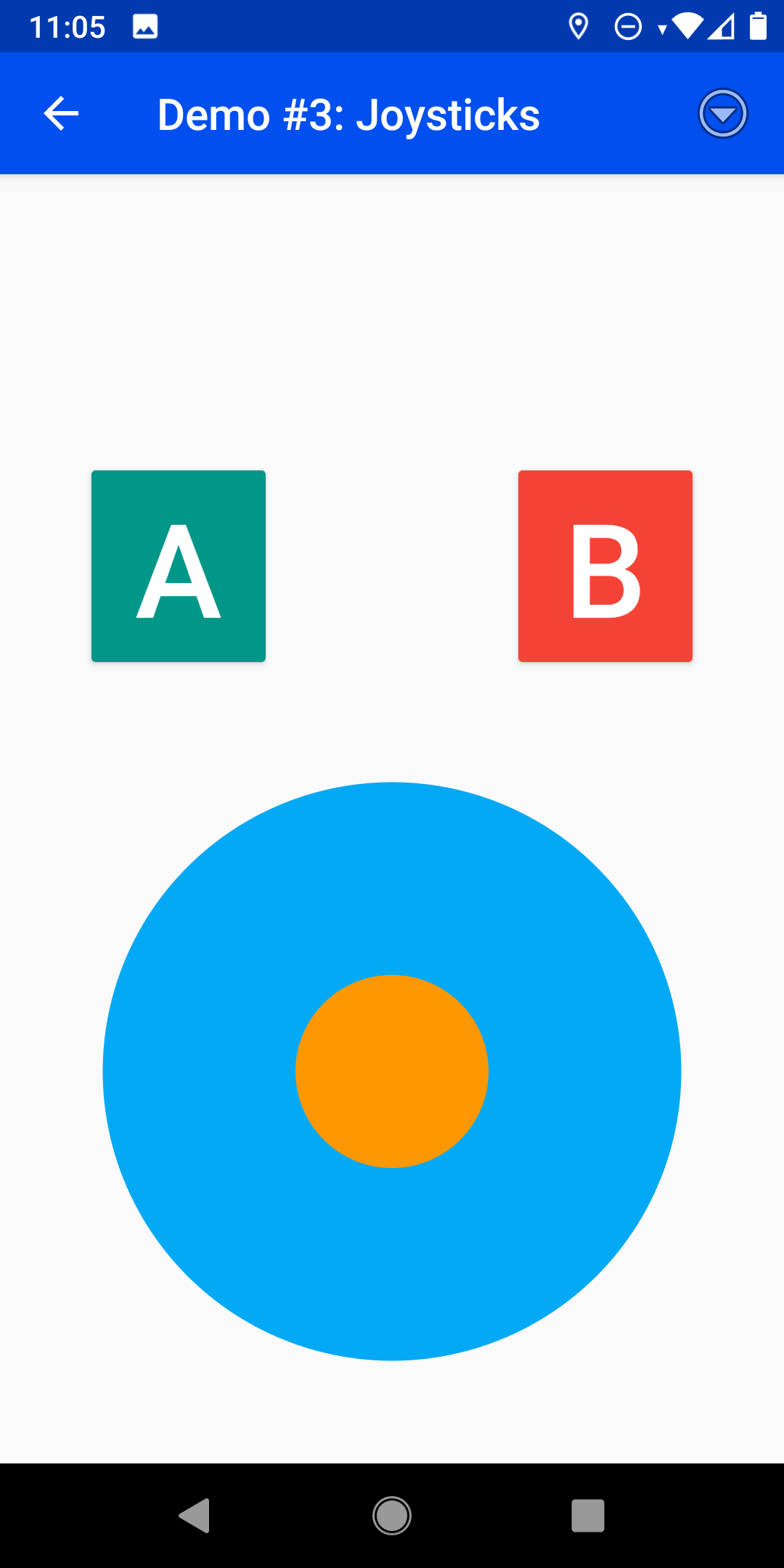
Demo #2: Buttons
The second demo is a "real life" example. It creates a gamepad
like user interface consisting of six buttons. The buttons are
arranged relative to each other using the
place attribute as explained in demo #1. Placement
starts with the ▲ button which is placed in the very center of
the screen. Left and right below this are the ◀ and ▶ buttons
and the ▼ is placed below these and horizontally centered.
We want the A and B buttons to be slighly above the ▲
button. This is accomplished using a space
element. This element is invisible and serves no other purpose
than to take up some screen space. In this example a 50 pixel
tall space is placed above the ▲ button. The A and B buttons are
then placed above this space but left and right of the first ▲
button just like the ◀ and ▶ buttons previously.
This demo also shows that you can use the full UTF-8 character
set including those neat triangles. Further examples of UTF-8
characters can be found at places
like w3schools.com.
Keep in mind that not all of these may be supported by all smart
devices.
Finally this demo shows how to use colors and how to set the
background color of the entire layout. Colors may be specified
by their names (e.g. 'white') but also by their RGB color
code. Places like
w3schools.com
provide tools to help finding the required RGB color codes.
The third demo highlights the joystick element. This joystick works like
a typical analog direction pad and delivers two values to the Arduino, one for the
x axis of the joystick and one for the y axis. The joystick can e.g. be used to drive
a mobile robot. The values for both axes range from -100 to 100.
Two additional buttons are placed above the joystick. This time a space
element with a horizontal width is used to place both buttons 100 pixels apart from
each other.
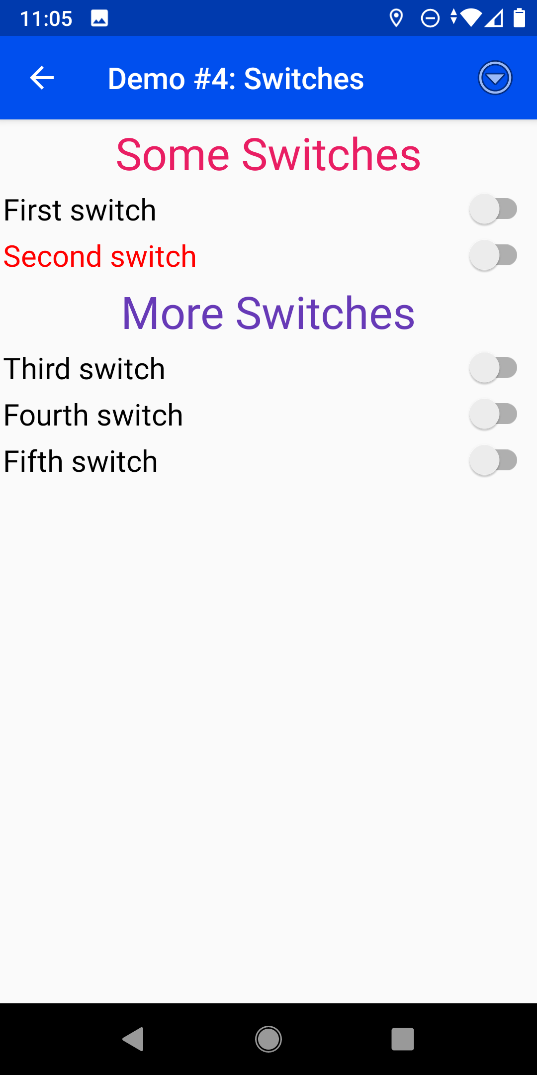
Another common element for user interfaces is the
switch. Switches share the basic functions with buttons and can
also be used to turn things on or off. But unlike buttons they
keep their state. Once switched on they stay on until they are
explicitely switched off again.
The fact that a switch can permanently change its state makes
it desireable to set the correct switch state whenever the app
reconnects to the Arduino. The app therefore requests the
current STATE from the arduino before it paints the
user interface. Upon receiving the STATE request the
Arduino can send the state of the switches to the app in order
to initialize them
properly. The example
sketch does this in
the ftduinoblue_state_callback() function.
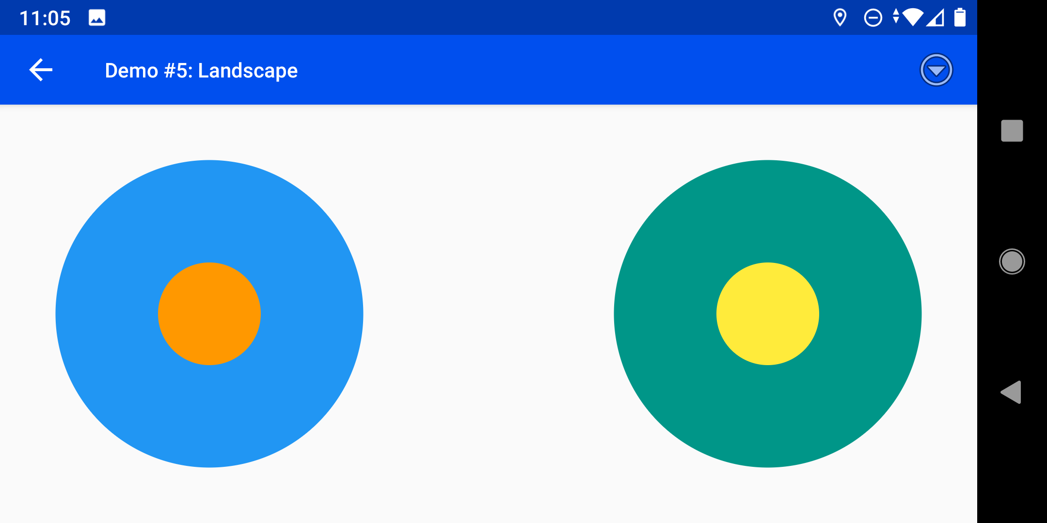
All demos so far were expecting to use the smart device in vertical portrait orientation.
To e.g. place two joysticks side by side a horizontal landscape layout would be more
appropriate. This demo achieves exactly that.
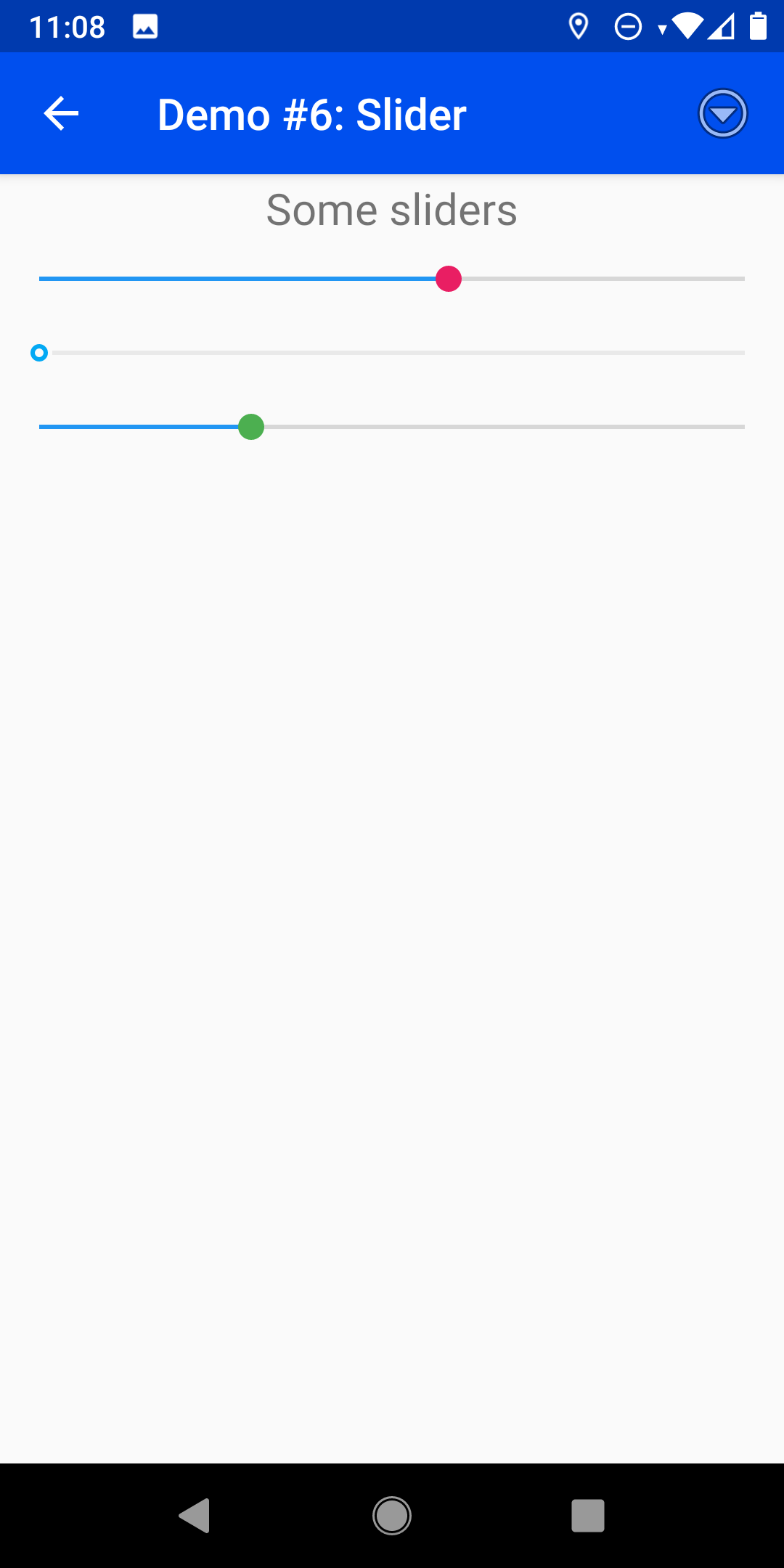
Sliders are another common user interface element. They can be used to set a value within
a given range. The range always starts with 0. The maximum value can explicitely be specifed
using the max attribute. By default the sliders range from 0 to 100.
Like switches the sliders keep their state and the user may
expect the sliders to be set to the current value at
startup. The example
sketch also does this in
the ftduinoblue_callback() function.
Furthermore this demo shows how to disable an element by
setting its enabled attribute to false making
the element unresponsive to user input. This may either be used
to indicate that manual interaction is not possible at this
moment. But this may also be used to create a display-only
element as the Arduino can still change the value and alter the
visual appearence of a disabled element.